To say that fashion websites are a bit out of my comfort zone is a definite understatement. For all that I’ve occasionally been accused of being stylish (rarely, I might add, and mostly in the overcoat department), understanding the fashion audience is a difficult intuitive leap for someone whose usual choices revolve around two questions: a) will it fit and b) is it available in black?
My client was Gerry Quinton — a corset-maker, seamstress and tailor extraordinaire. I’d also built her previous website, but her work had shifted in a new direction since then and the site was in need of a complete overhaul.
I found there’s an additional dimension when it comes to working with an artistic client — someone with the very precise ideas of colour and form that come with doing their job — but with little experience of applying their three dimensional skills to the two dimensional web.
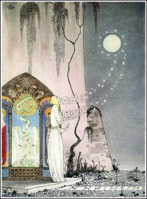
We went through several iterations before we hit on one with potential, and that came about because of a picture we found that perfectly encapsulated the mood my client wanted to capture for people visiting her website — a sense of magic, ethereal beauty and longing.
This helped us develop a central style for the website which we were both relatively happy with. But as with most websites, without content, it was difficult to see the full potential.
The fashion industry is heavily image-based, and my client needed the right images (and the right words) to properly realise the website. This took time to collate — my client had a good, solid set of images from previous photoshoots but some of them were not high resolution enough for what we had in mind. As she’d recently moved to Chicago and her photographer contacts were in London, we had to wait for a return visit to get the beautiful photographs of her latest work that made the website complete.
In the meantime we worked on the text. Often a neglected art, my client instead refined it again and again — taking successive round of feedback from me, from friends in the industry, from a business course she attended, and from her business partner.
When you’re developing a website like this, the photographs tell perhaps 90 per cent of the story — but the last ten per cent that is text is the hardest fought — and so it should be. It’s the closer, the deal clincher, it takes a website visitor from being merely interested to being an investor.
It was designed using an adapted WordPress template. If the website is likely to be subject to a considerable amount of updating, wordpress is my free CMS of choice, mostly due to it’s high level of usability for those without coding experience.
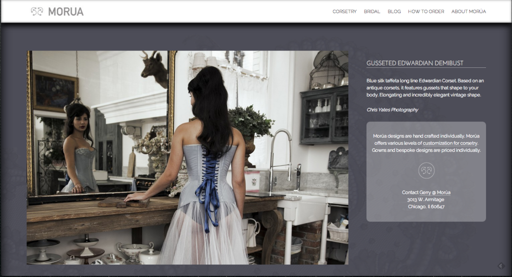
So without further ado, here’s the website itself — morudesigns.com.
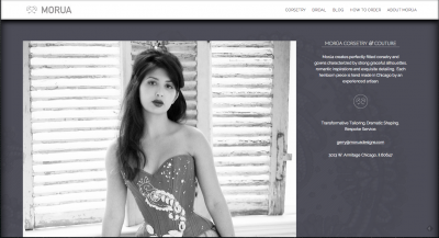
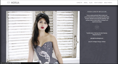
On a computer (rather than a tablet or phone), the images are greyscale at first. On hover they burst into full-coloured life, hopefully compelling exploration.


Each individual picture has a personalised explanation, and an encouragement to explore customisation options and contact the designer:
Gerry can easily update pictures, galleries, and text. Very few elements are hard-coded. She also writes a blog — a place to put explorations of her corsetry methods — often derived from very close study of historical garment making — and her travels in the name of good corsetry.
I’m still working on mobile optimisation, but hopefully that should be ready in the next couple of months.
In the meantime, feel free to enjoy the site on tablet and computer!
Corinne Pritchard
Latest posts by Corinne Pritchard (see all)
- Linked — 5 September 2016
- Designing a fashion website — 26 October 2014
- Service design conference — 9 October 2014
