I’ve been skirting the edges of the open data movement since I started this site. For those not in the know, open data is when governments and big corporations release their figures to the world — financial figures, crime figures, bus figures — anything and everything, for people to do what they want with. Some great projects like fixmystreet have come out of it.
I really believe this data transparency can help us achieve great things. So I was very happy when I first went to an open data conference and started talking about plain language, as people were very receptive. It’s not just about the data, I tried to say — you have to make sure you’re giving people the right advice about how to interpret the data too, and for that you need plain language. Great, they said, then walked away to talk about XML or some other programming thing. Why? Well, most of them were programmers, so that makes sense. And I came to the eventual conclusion that because plain language can’t be programmed — it’s not an ‘easy’ win — people lost interest quickly.

Which is why Alice Bell’s post Making ‘Nullius’ Public really resonated with me. Open data is a fantastic goal, and I wholeheartedly support what its trying to achieve and the lengths the movement has gone to, to successfully court both this government and the last. But to be really accessible, and truly usable, it needs sound interpretation and clear communication.
From a (semi-)professional plain language perspective, I believe open data really benefits from exposure to experts and interpreters, and vice versa. Infographics can be a good example of this. However, they are usually built on a direct data-to-interpreter relationship, which can lead to mistakes, and if they’re popular, those mistakes can be compounded. The question for me is does interpreter alone necessarily have all the knowledge to get to the bottom of an issue? For me, that answer is usually no, and I’m not afraid to admit it.
For example, I really wanted to take part in the latest financial challenge from Information is Beautiful. I looked at the data, examined GDP and debt relationships — apparently external debt (what we owe other countries) is more important than internal debt for measuring financial stability — ranked countries (according to my calculations Ethiopia is one of the financially healthiest countries in the world… ahem), examined the data for patterns, but I knew, ultimately, that I was missing something too big to make doing the infographic worth my while. My interpretation, whatever it might have turned out to be, would be essentially worthless, because I didn’t have the knowledge. I didn’t know what the variables were.
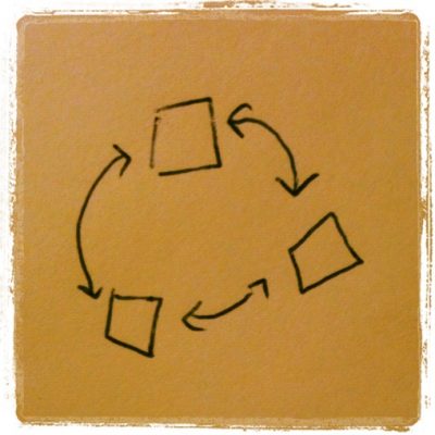
In an ideal world, as a graphic and written interpreter of data, trends and world events, I’d have access to something resembling the journalistic process, an information triangle of:
- The hard data to provide the bedrock for my argument.
- An unbiased expert (or two oppositely biased ones, as long as they could legitimately be called experts) on call to fill in the knowledge gaps that skew my calculations.
- My own expertise in communicating stories (such as it is).
I feel we would all benefit immeasurably from a way to reach out to each other: open data specialists and technologists; plain language writers and communications people; scientific, economic, political and other experts for help with our issues.
Corinne Pritchard
Latest posts by Corinne Pritchard (see all)
- Linked — 5 September 2016
- Designing a fashion website — 26 October 2014
- Service design conference — 9 October 2014